New Look
Saturday, 29 March 2008
As you may have noticed - in the unlikely event that: a) you're reading this at all; and b) you're not reading it in a news reader - that I switched the site from RapidWeaver's built-in iPhone theme to seyDesign's dogPress theme.
I am still not happy with it, but then I can't do web design for toffee, so I'll just have to be okay with the fact that it at least looks a tad better. It's still too narrow, and I had to pants around making the images smaller as the hard edge now makes them look awful when they stick out. RapidWeaver makes this inconceivably (I'll wait for you to reminisce about the Princess Bride here...okay, let's continue) painful. It lulls you into a false sense of security, because it does have a built-in feature to let you scale images, right in its Media Inspector:
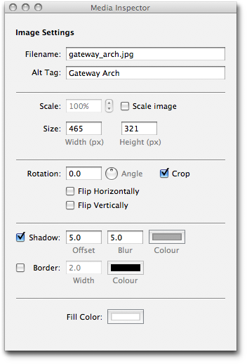
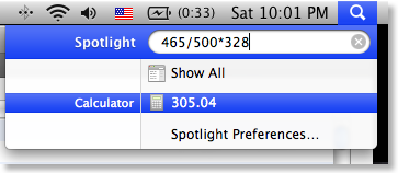
Handy, right? Well, the problem is it that if you check "Scale Image" and start modifying the percentage, it does not update the height and width values shown below, or show the new values anywhere else that I could see. My theme has a constrained width for images of about 465 pixels, which I determined from experimentation. If scaling would update the size fields, I could just reduce the percentage until the height showed 465. But, because it doesn't, I have no choice but to disable it and scale the image by hand. So I enter the height of 465 and then determine the new height with 465/original-width*original-height. The only saving grace here is that Spotlight will do basic calculations right in its search window:
Very handy, but RapidWeaver should not have made me use it in the first place.
RapidWeaver also won't let you preview old blog posts; normally that wouldn't be an issue, but it was for me when trying to find all the images that were too wide for the new theme. I ended up publishing the site as-is then using Safari to walk though it all and find the problem articles.
I picked the blue variant of the dogPress theme and tuned the title and sub-title colours a little. I then used a photograph of The Gateway Arch in Saint Louis to make the header my own. Here's the original shot:
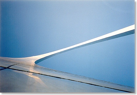
I took this in 1992 with my Olympus μ1, a very compact and cool-looking (IMHO) film camera. I held it against the side of the arch pointing up; if you look closely, you'll see the observation windows at the top of the arch in the center of the image.
So whaddya reckon? Less or more ugly than before?
I am still not happy with it, but then I can't do web design for toffee, so I'll just have to be okay with the fact that it at least looks a tad better. It's still too narrow, and I had to pants around making the images smaller as the hard edge now makes them look awful when they stick out. RapidWeaver makes this inconceivably (I'll wait for you to reminisce about the Princess Bride here...okay, let's continue) painful. It lulls you into a false sense of security, because it does have a built-in feature to let you scale images, right in its Media Inspector:
Handy, right? Well, the problem is it that if you check "Scale Image" and start modifying the percentage, it does not update the height and width values shown below, or show the new values anywhere else that I could see. My theme has a constrained width for images of about 465 pixels, which I determined from experimentation. If scaling would update the size fields, I could just reduce the percentage until the height showed 465. But, because it doesn't, I have no choice but to disable it and scale the image by hand. So I enter the height of 465 and then determine the new height with 465/original-width*original-height. The only saving grace here is that Spotlight will do basic calculations right in its search window:
Very handy, but RapidWeaver should not have made me use it in the first place.
RapidWeaver also won't let you preview old blog posts; normally that wouldn't be an issue, but it was for me when trying to find all the images that were too wide for the new theme. I ended up publishing the site as-is then using Safari to walk though it all and find the problem articles.
I picked the blue variant of the dogPress theme and tuned the title and sub-title colours a little. I then used a photograph of The Gateway Arch in Saint Louis to make the header my own. Here's the original shot:
I took this in 1992 with my Olympus μ1, a very compact and cool-looking (IMHO) film camera. I held it against the side of the arch pointing up; if you look closely, you'll see the observation windows at the top of the arch in the center of the image.
So whaddya reckon? Less or more ugly than before?