Theme Change
Sunday, 11 November 2007
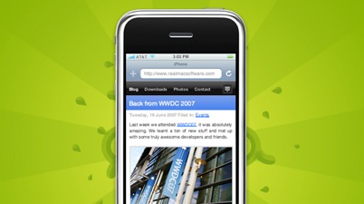
I switched to RapidWeaver's iPhone theme today. I was using a hand-tweaked version of Dark Glass, but it just wasn't cutting it for me. I couldn't get the code extracts to look good, and when I posted pictures that were wider than the blog column it looked bad and stomped on the tag/archive sidebar (usually I cut them down but sometimes I'm linking directly from another site). In the iPhone theme that information is moved to a pull-down which keeps the main page nice and clean. I like clean. Hope you do too.

